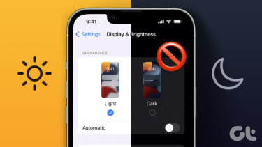
Dark Mode inverts the colors but in a very Apple-like way. The Helvetica font is now white instead of black and the white translucent layers are replaced with black translucent layers. To find out how to enable and customize this mode, read on.
How To Enable The Dark Mode In Yosemite
Step 1: Open System Preferences. Step 2: Go to General. Step 3: Under the Appearance option you’ll see an option called Use dark menu bar and dock. This will instantly switch those elements to the darker shade.
What Has Changed In Dark Mode?
Wondering what exactly gets the Dark Mode treatment? Text in the menu bar turns from black to white and the background goes from a bright white translucent layer to an almost transparent, greyish-black color. If you’re using a non-Retina display, it can be hard to read the text on the transparent background, but don’t worry, we’ve detailed a fix below. The Dock gets a dark mode as well. Here the effects are much more pronounced than with the menu bar. The background is translucent but nowhere near as frosty. This makes it quite easy to make out the icons. Spotlight Search also gets the Dark Mode treatment and just like the Dock it’s not nearly as translucent as the menu bar. Reading the white text is not at all a problem. The App Switcher gets the dark treatment as well. The Dark Mode isn’t available everywhere: While we wish the Dark Mode was enabled in apps like Finder, it’s not. Third party developers can take advantage of this feature if they please. We might see some special Dark Mode app settings in the future.
Extra Settings That Compliment The Dark Mode
So the Dark Mode is limited, but let’s try to make the rest of the system compliment the dark setup.
A: Make The Traffic Lights Graphite
The traffic lights in Yosemite are too colorful. On the same General section in the System Preferences menu, select Graphite from the drop down menu beside Appearance.
B: Reduce Transparency And Go Really Dark
From Accessibility in System Preferences check Reduce Transparency. This will remove the translucent layer from the menu bar and other places, something that defines Yosemite’s look. After turning this setting on, you’ll see a plain, black strip in the menu bar, the dock, and more importantly, Finder and other apps that had the translucent title bars.
Dark Mode Looks Epic If You Have A Retina MacBook
As the story goes, Yosemite was made for a Retina display and it looks inferior on anything below that. Helvetica font is incredibly sharp on the Retina display but just OK on the non-Retina ones. What if you have a non-Retina display but want to enjoy the goodness of the Dark Mode? Simple, turn on the Reduce Transparency option as stated above. This makes a huge difference and actually makes text readable in the menus.
What Do You Think Of The Dark Mode?
What do you think of Yosemite’s new look? Will you be using the Dark Mode all the time or just for those night time exploits? Let us know in the comments below. The above article may contain affiliate links which help support Guiding Tech. However, it does not affect our editorial integrity. The content remains unbiased and authentic.


