Most of Finder’s best, most powerful features are hidden by default. Here are a few and how you can enable them to make the most out of Finder.
Enable Path Bar, Status Bar, and Preview
In Finder, try enabling these three separate features. You don’t need to have them all enabled all the time if you’re not a fan of excessive toolbars and clutter, but maybe just one could help you significantly as you browse. With Finder as the active window, click View in the menu bar. Click Show Path Bar first. The Path Bar allows you to see the path of any file you select in Finder so that you know exactly where it’s located and how to get there next time. Click any file to see the hierarchy of drives, folders and subfolders leading to its location. This feature is especially useful if you’re browsing through the All My Files section with scattered files everywhere. If you double click a folder in the Path Bar, it’ll take you back to that location too. Click Show Status Bar in the View menu. This one doesn’t do very much other than show you which files are selected, but it does provide a nice slider for magnifying the icons. If you want better previews without opening the files, it could help to adjust this slider as necessary. Lastly, Preview would solve that problem too. Click Show Preview in the View menu to introduce a new sidebar. Click any item and you’ll get an enlarged preview as well as some basic information about the file type and size. You can also add tags for sorting. More on those in a bit.
Add Specific Tools to Your Toolbar
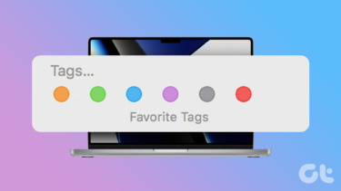
You probably already know that you can customize the toolbar in Finder with a control-click. For our purposes, we’re just going to focus on two tools disabled by default. Control-click and select Customize Toolbar… to view the options. You’ll want to drag the Path button and Tags button into your toolbar. Path is a simplified version of the aforementioned Path Bar. If you don’t want to take up valuable screen real estate with a horizontal bar, disable Path Bar and use the Path toolbar icon instead. It provides all the same functionality, but in a condensed dropdown menu. Tags are a powerful sorting feature that allow you to categorize files from different folders and locations in a group. Apple’s default tags are just colors, but you can name them anything you want. For instance, if you’re creating a work presentation, you might have a “presentation” tag containing some images from your Pictures folder, PDFs in your documents, and a video in Movies. Access your tags in the left sidebar of Finder. The Tags toolbar button lets you quickly apply tags to any selected file(s).
Tweak Finder’s Settings
One last important customization tip: enable the viewing options. You guessed it, that’s in the View menu yet again: click Show View Options at the bottom. This customization box is a rarely acknowledged gem of macOS. It lets you customize so much about Finder including arrangement, icon size, grid spacing, text size, label positions, item info and preview. Feel free to play around with these settings to make Finder as usual as possible within your own context. I recommend ticking Show item info to display file sizes and image dimensions underneath the files. Ultimately, Apple isn’t always known for providing customization options to its users, but Finder is a major exception. Experiment with these tools and toolbars. Tweak the look and feel of Finder entirely to transform it into a productivity powerhouse. ALSO READ: How to Add Power Features to Finder in Mac Using XtraFinder The above article may contain affiliate links which help support Guiding Tech. However, it does not affect our editorial integrity. The content remains unbiased and authentic.
![]()


