But at some point, they have to put on their big boy pants and think about revenue. And each developer deals with it differently. Some do it well, some don’t. ES belongs to the latter category. Over the last couple of months, ES has been changing steadily. It started with a half-assed, not really sensible Material Design coat of paint. Then some interface changes, and finally the obvious – a built in “cleaner utility” (read: bloatware) and spam notifications. If you’re like me, you’ve had enough. And you want to move on.
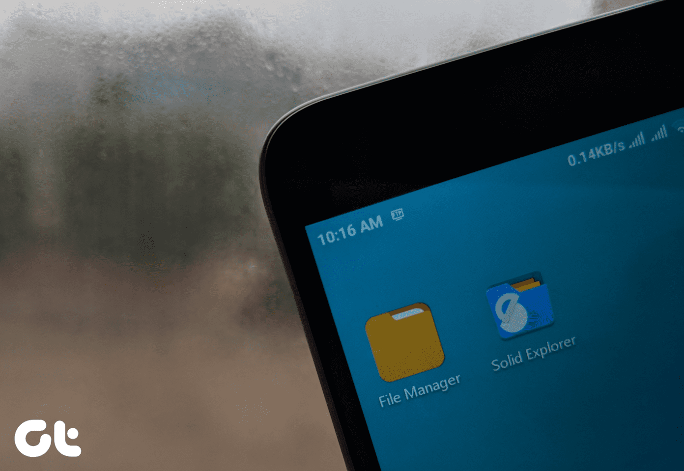
1. Solid Explorer
Solid is the best alternative to ES. And in many ways, it’s the stark opposite. It’s built on Material Design from the ground up. It looks good. And it’s not completely free like ES. And I’m sure you’ve realized this by now – that’s a good thing. The fact that you can support Solid Explorer’s developers, for whom this is a job, means that Solid won’t go down the same route as QuickPic or ES. I realize that hardcore ES Explorer fans might not “get” Solid Explorer at the first try. The UI is completely different, and at first glance it might look like you don’t have access to powerful features. But they’re there, they’re just located at different places. Here are Solid Explorer features you’ll care about.
Internet memory and root explorer.Cloud account support – Google Drive, Dropbox, OneDrive and more.Dual pane interface. Easy to copy files between folders and panes.SMB and local network support.Archive support.Ability to hide file and folders.Chromecast support.Media browser.Plug-in support for additional functionality.
The hardcore ES user who used ES to do 15 different things will feel comfortable with Solid. Almost all the important features of ES are available here. As I said above, the app provides a 14-day trial. After that, you can unlock the app using a $1.99 in-app purchase.
2. FX File Explorer
Interface wise, FX File Explorer is the closest thing to ES available right now (folder UI, long-press modal popups, navigation bar and more). While the app does have Material Design elements, it doesn’t go all in. And unlike Solid’s focus on lists, FX goes with icons. That means you get much richer file previews (image thumbnails, album cover art). Plus, you can pinch in and out to make the folder previews smaller/bigger. FX is free to boot, but you’ll probably want to pay $2.49 for FX Plus that adds cloud sync, FTP, SMB and media management features. A 7-day trial is available and the Root Access add-on is available for free. FX’s split view is also pretty cool. We’ve talked about it in detail here.
3. Cabinet
Cabinet is a delight. Cabinet looks so good and is so thoughtfully designed that it’s hard to tell that it’s a file explorer. You know, like ES. Cabinet (which is free and still in beta, but totally usable) is a minimalist file explorer. The minimalist tag goes for both the UI and the features. Cabinet is designed as a pure file explorer. The app you use to find the folders or files you want, open them in the app of your choice or to move some stuff around. Cabinet isn’t loaded with 36 different features. There’s no cloud sync option, FTP, local network streaming, app backup, or fast Wi-Fi transfer. Cabinet’s UI is really simple. There’s no complicated interaction – no long press menus, or gestures. It’s all based on the three dotted menus and toolbar options. Tap the three dotted menu button beside any folder or file to view all the actions you can do – copy, move, share and the like. And moving/copying files is also pretty straightforward. Here, the floating action button becomes the clipboard button. Also, the navigation bar is big and clear. If you’re looking for a basic file manager – just to open and move files and don’t need any extra features – stop looking around and just go with Cabinet. Currently, Cabinet is free to use but you can donate ($1 to $20) to support the continued development.
4. Amaze
Amaze is similar to Solid Explorer. But it’s completely free. Before you jump to any conclusions, let me tell you that Amaze is an open source app. That means that the developer shares the app’s code with the internet. If you want, you can contribute to the app’s development on Github. You know how some free things are actually good? Amaze is that kind of an app. Much like Solid, it uses Material Design guidelines all over. You can switch between themes. Basic functions like copy and move are more pronounced. But unlike Cabinet, Amaze is loaded with features. App manager (backup, uninstall), SMB (file sharing from Windows), root explorer, multiple window support and more. And in my experience, I’ve found Amaze to be one of the fastest file explorers out there. On my OnePlus One running Android 5.1, I was blown away by just how fast the app launches.
Which One Is For You?
If you’re an Android power user who’s used ES for the past few years and you’re equipped to pay a couple of dollars for an app, you should go and download Solid Explorer – no doubt about that. But if, for some reason, you’re unable to pay – you should look into Amaze. It’s almost as feature rich as Solid and it’s free and open source. For a casual user who wants to use a file explorer just as a file explorer and nothing more – go with Cabinet.
What Do You Think?
What’s your opinion on the whole file explorer debacle? Did you already switch from ES? How was the experience? Which app did you choose and why? Share with us in the comments below. We’d love to hear about your explorations. The above article may contain affiliate links which help support Guiding Tech. However, it does not affect our editorial integrity. The content remains unbiased and authentic.


